Understanding CSS Flexbox in depth
"Flex Your Design Muscles: An Epic Adventure into the World of CSS Flexbox"


Table of contents
- What is CSS Flexbox?
- Why use Flexbox for layout design?
- Understanding the Flex Container and Flex Items
- What are the Main axis and Cross axis?
- Flex Container Properties
- Flex Item Properties
- Resources
- Flexbox Games
- Source Code
What is CSS Flexbox?
A one-dimensional layout approach that offers space distribution and alignment capabilities is called the Flexible Box Model. The flexible box module usually refers as Flexbox. Before Flexbox, we used to align elements using floats and tables. With the introduction of Flexbox in CSS our life got easier.
Note:
"One-dimensionally" means Flexbox allows designing the box model either in a row or column at a time.
Flexbox is unable to simultaneously lay out box models in a row and a column.
We use CSS Grid for laying out box models simultaneously in a row and a column that is "Two-dimensionally"
Why use Flexbox for layout design?
Imagine that our website is divided into three sections: the header, the main content area, the footer. To arrange these sections on the page traditionally, we would use CSS positioning and floats, but this can be time-consuming and lead to unexpected behaviour when the content changes.
With Flexbox, we can easily create a flex container for these sections and use the flex-direction property to specify whether they should be arranged horizontally or vertically which makes Flexbox easier to use.
Understanding the Flex Container and Flex Items
In CSS Flexbox, a Flex Container is a parent element that contains display property of an HTML element to flex or inline-flex. Flex Items are those elements that are the direct children of a Flex Container.
Example:
We have a flex container in yellow color having a display property set to flex and its child elements in the white square are the flex items.
What are the Main axis and Cross axis?
The main axis and cross axis are the two main axes in Flexbox that control the arrangement and alignment of the child items inside a flex container.
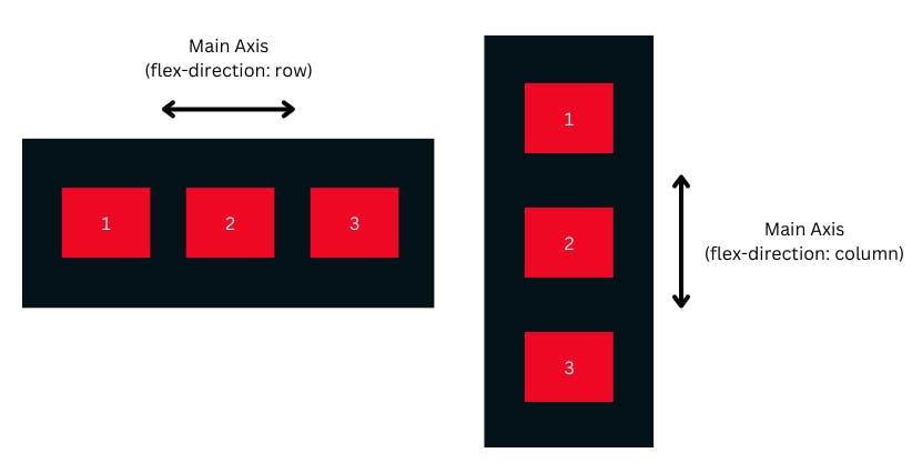
Main Axis
The Main axis is the primary axis along which the child elements are laid out. By default, the main axis is horizontal and runs from left to right in a row direction, or vertical and runs from top to bottom in a column direction.
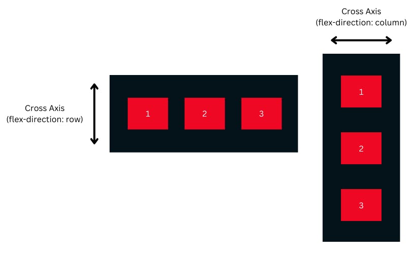
Cross Axis
The Cross axis, on the other hand, is the axis perpendicular to the main axis. In a row direction, the cross axis is vertical, and in a column direction, the cross axis is horizontal.
Flex Container Properties
1. Flex Direction
Flex Direction gives browsers specific instructions on which row or column to place the direct children, or flex items, of a flex container.
Syntax
/* Syntax and values */
.flex-container {
    display: flex;
    flex-direction: row | column | row-reverse | column-reverse;
}
Values
1. Row
The flex items are arranged in a row and are displayed horizontally. It serves as the default value of flex-direction.
Syntax
/* Syntax and values */
.flex-container {
    display: flex;
    flex-direction: row;
}
Example
2. Column
The flex items are arranged in a column and are displayed vertically.
Syntax
/* Syntax and values */
.flex-container {
    display: flex;
    flex-direction: column;
}
Example
3. Row Reverse
The flex items are arranged in a row and are displayed horizontally, but in reversed order
Syntax
/* Syntax and values */
.flex-container {
    display: flex;
    flex-direction: row-reverse;
}
Example
4. Column Reverse
The flex items are arranged in a column and are displayed vertically but in reversed order
Syntax
/* Syntax and values */
.flex-container {
    display: flex;
    flex-direction: column-reverse;
}
Example
Note:
flex-directiondetermines the Main axis of a flexbox.The
flex-directionthe attribute has no impact if the element is not a flex item.The default value
flex-directionisrow.
2. Flex Wrap
Determines whether the flex items should wrap if they overflow the flex container. Possible values are nowrap, wrap, wrap-reverse.
Syntax
/* Syntax and values */
.flex-container {
    display: flex;
    flex-direction: nowrap | wrap | row-reverse;
}
Values
1. Nowrap
It is the default value and specifies that the flex items will not wrap if they overflow the flex container.
Syntax
/* Syntax and values */
.flex-container {
    display: flex;
    flex-wrap: nowrap;
}
Example
2. Wrap
It is the default value and specifies that the flex items will wrap if they overflow the flex container.
Syntax
/* Syntax and values */
.flex-container {
    display: flex;
    flex-wrap: wrap;
}
Example
3. Wrap Reverse
It is the default value and specifies that the flex items will wrap in reversed order if they overflow the flex container.
Syntax
/* Syntax and values */
.flex-container {
    display: flex;
    flex-wrap: wrap-reverse;
}
Example
3. Justify Content
It defines how elements within a flexible container should be positioned in relation to the main axis of the flexbox. Possible values are flex-start, flex-end, center, space-between, space-around, space-evenly.
Syntax
/* Syntax and values */
.flex-container {
    display: flex;
    justify-content: flex-start | flex-end | center | space-between |
                                space-around | space-evenly;
}
Values
1. Flex Start
The Flex items are positioned at the beginning of the Flex container, and it is the default value.
Syntax
/* Syntax and values */
.flex-container {
    display: flex;
    justify-content: flex-start;
}
Example
2. Flex End
The Flex items are positioned at the end of the Flex container.
Syntax
/* Syntax and values */
.flex-container {
    display: flex;
    justify-content: flex-end;
}
Example
3. Center
The Flex items are positioned at the center of the Flex container.
Syntax
/* Syntax and values */
.flex-container {
    display: flex;
    justify-content: center;
}
Example
4. Space Between
The Flex Items will be separated from one another by space.
Syntax
/* Syntax and values */
.flex-container {
    display: flex;
    justify-content: space-between;
}
Example
5. Space Around
It gives each side of the Flex items the same amount of spacing in a flexible container. As a result, the space between each pair of pieces is half as wide as the space before and after each item.
Syntax
/* Syntax and values */
.flex-container {
    display: flex;
    justify-content: space-around;
}
Example
6. Space Evenly
It provides the Flex items with equal space between them and around them.
Syntax
/* Syntax and values */
.flex-container {
    display: flex;
    justify-content: space-evenly;
}
Example
4. Align Items
It defines how elements within a flexible container should be positioned in relation to the cross-axis of the flexbox. Possible values are flex-start, flex-end, center, baseline, stretch.
Syntax
/* Syntax and values */
.flex-container {
    display: flex;
    align-items: flex-start | flex-end | center | baseline | stretch;
}
Values
1. Flex Start
The Flex items are positioned at the beginning of the Flex container.
Syntax
/* Syntax and values */
.flex-container {
    display: flex;
    align-items: flex-start;
}
Example
2. Flex End
The Flex items are positioned at the end of the Flex container.
Syntax
/* Syntax and values */
.flex-container {
    display: flex;
    align-items: flex-end;
}
Example
3. Center
The Flex items are positioned at the center of the Flex container.
Syntax
/* Syntax and values */
.flex-container {
    display: flex;
    align-items: center;
}
Example
4. Baseline
The Flex items are positioned at the baseline of the Flex container.
Syntax
/* Syntax and values */
.flex-container {
    display: flex;
    align-items: baseline;
}
Example
5. Stretch
The Flex items are stretched to fit the Flex container and it's the default value of align-items.
Syntax
/* Syntax and values */
.flex-container {
    display: flex;
    align-items: stretch;
}
Example
5. Align Content
It describes how the lines of a flex container should be placed along the flexbox's cross-axis. A flexbox with only one line, for example, a flexible containerflex-wrap: nowrap is unaffected by the align-content attribute. In other words, only flexboxes with many lines support align-content.
Syntax
/* Syntax and values */
.flex-container {
    display: flex;
    align-content: flex-start | flex-end | center | space-between |
                    space-around | space-evenly | stretch;
}
Values
1. Flex Start
It Aligns the rows to the start of the Flex container.
Syntax
/* Syntax and values */
.flex-container {
    display: flex;
    align-content: flex-start;
}
Example
2. Flex End
It Aligns the rows to the end of the Flex container.
Syntax
/* Syntax and values */
.flex-container {
    display: flex;
    align-content: flex-end;
}
Example
3. Center
It Aligns the rows to the center of the Flex container.
Syntax
/* Syntax and values */
.flex-container {
    display: flex;
    align-content: center ;
}
Example
4. Space Between
It Distributes the rows evenly with space between them inside the Flex Container.
Syntax
/* Syntax and values */
.flex-container {
    display: flex;
    align-content: space-between;
}
Example
5. Space Around
It Distributes the rows evenly with space around them inside the Flex Container.
Syntax
/* Syntax and values */
.flex-container {
    display: flex;
    align-content: space-around;
}
Example
6. Space Evenly
It Distributes the rows evenly with equal space around them inside the Flex Container.
Syntax
/* Syntax and values */
.flex-container {
    display: flex;
    align-content: space-evenly;
}
Example
7. Stretch
It Stretches the rows to fill the entire Flex container.
Syntax
/* Syntax and values */
.flex-container {
    display: flex;
    align-content: stretch;
}
Example
6. Gap
In CSS, the gap property is used to add space between flexbox items or grid items. It specifies the amount of space between the rows or columns of a grid or between the items of a flex container.
Syntax
/* Syntax*/
.flex-container {
    display: flex;
    gap: <gap-size>;
}
Example
Flex Item Properties
1. Flex Grow
Determines how much the flex item should grow relative to the other flex items. Possible values are any non-negative number.
Syntax
/* Syntax*/
.flex-item {
    flex-grow: <grow-size>;
}
Example
In the below example, the second flex item will grow twice wider than the rest of the flex items inside the flex container.
2. Flex Shrink
Determines the initial size of the flex item before any free space is distributed. Possible values are any length value.
Syntax
/* Syntax*/
.flex-item {
    flex-shrink: <shrink-size>;
}
Example
In the below example, the second flex item will shrink twice as the rest of the flex items inside the flex container.
3. Flex Basis
Determines the initial size of the flex item before any free space is distributed. Possible values are any length value.
Syntax
/* Syntax*/
.flex-item {
    flex-basis: <basis-length>;
}
Example
In the below example, the second flex item will have an initial length of 100px.
4. Order
This property in Flexbox allows us to change the visual order of elements within a container, without changing the HTML structure.
Syntax
/* Syntax*/
.flex-item {
    order: <value>;
}
Example
5. Align Self
This property is used to align individual flex items or grid items along the cross-axis, which is the perpendicular axis to the main axis.
Syntax
/* Syntax and Values*/
.flex-item {
    align-self: auto | flex-start | flex-end | center | baseline | stretch;
}
Values
1. Auto
It is the default value, which means the item inherits the value of its parent container's align-items property.
Syntax
/* Syntax and values */
.flex-item {
    align-self: auto;
}
Example
2. Flex Start
This aligns the particular Flex item to the start of the cross-axis.
Syntax
/* Syntax and values */
.flex-item {
    align-self: flex-start;
}
Example
3. Flex End
This aligns the particular Flex item to the end of the cross-axis.
Syntax
/* Syntax and values */
.flex-item {
    align-self: flex-end;
}
Example
4. Center
This centers the particular Flex item vertically within the Flex container along the cross-axis.
Syntax
/* Syntax and values */
.flex-item {
    align-self: center;
}
Example
5. Baseline
This aligns the Flex item to the baseline of the Flex container.
Syntax
/* Syntax and values */
.flex-item {
    align-self: baseline;
}
Example
6. Stretch
It stretches the Flex item to fill the entire cross-axis of the Flex container.
Syntax
/* Syntax and values */
.flex-item {
    align-self: stretch;
}
Example
Resources
Flexbox Games
Source Code
Thanks for sticking with me till the end! I hope this guide on CSS Flexbox didn't give you nightmares about flexing boxes, but instead helped you create flexible and responsive layouts for your web projects.
If you found this guide helpful or have any feedback, suggestions or jokes (yes, I take jokes), let me know in the comments below.
And before you go, don't forget to check out the Flexbox games at flexboxfroggy.com or flexboxdefense.com. They're so fun and addictive, you might find yourself flexing boxes in your dreams!
Thanks for reading, and keep flexing those boxes! 💪